Colour In 2026 - Part 1 | A Considered Shift
- Jan 13
- 4 min read
If the past decade was about cool greys, stark minimalism, and interiors that whispered rather than spoke, then colour in 2026 is nudging homes into something warmer and quietly expressive. Colour is no longer about “the shade of the moment” or Instagram-ready palettes; it’s about how a room feels, how it supports everyday life, and how it ages with grace.
Across UK paint brands and interior design houses, the mood is clear: interiors want emotion, warmth, and personality, delivered with subtlety.
“As we look ahead to 2026, there seems to be a palpable shift in the colours people are gravitating towards for their home,” notes Kate Palmer, Creative Director at The Painted Furniture Company. “Soft earth tones and muted greens… bring a sense of calm and connection to nature. Warm Eucalyptus from Valspar is naturally restorative and serene, it taps into a longing for the outdoors, without feeling overtly leafy, and becomes a host for calm, everyday living.”
Her observation neatly encapsulates the year’s underlying trend: a desire for interiors that feel grounded, lived-in, and quietly optimistic.
Warm, Layered Neutrals
Neutrals in 2026 are no longer pale, flat, or purely functional. UK paint brands, from Farrow & Ball to Dulux and Little Greene, are highlighting warm, earthy tones that form a rich backdrop for life. Think oat, clay, mushroom, camel, and soft brown; shades that feel tactile and comforting, yet versatile enough to pair with textures, furniture, and subtle pops of colour.
Farrow & Ball’s forecast highlights shades like Jitney, a soft, sandy neutral, and Dibber, a brown-green hybrid that behaves as a calming neutral with depth. Dulux is championing olive-leaning neutrals such as Willow Tree, which read simultaneously sophisticated and natural, offering an alternative to grey that doesn’t feel cold.
“Earthy neutrals such as warm oat, mushroom, camel, and clay pair beautifully with natural textures like rope, boucle, and weathered wood. They bring calm without slipping into boring,” observes Where Saints Go, reflecting a broader industry consensus.

Green As A New Comfort Colour
If there is a single colour family capturing attention in 2026, it’s green, though not in the pastel or minty form of years past. We are seeing earthy olives, muted sages, and deep forest tones that evoke calm, stability, and connection to nature. These hues act as an emotional anchor, giving rooms a sense of serenity without blandness.
Neptune and Little Greene are both pushing these tones in their palettes, framing them as versatile neutrals that pair effortlessly with wood, stones, and woven textiles. Palmer adds: “Greens remain unstoppable, moving from soft sages into richer olives and deep forests, the new go-to for grounding a space without draining the personality from it.”
This trend isn’t purely decorative. It reflects the growing interest in interiors that restore energy and support well being, a nod to biophilic design without the fuss of houseplants on every windowsill.

Warm Reds, Terracotta, & Moody Shades
2026 also marks a gentle rebellion against muted minimalism. While earthy neutrals and greens dominate, there’s room for warmer, expressive shades: sun-baked terracotta, soft apricots, muted reds, and aubergines. These tones bring intimacy, personality, and visual interest to spaces that might otherwise feel flat.
Little Greene’s Adventurer, a deep, plummy aubergine, is emerging as a standout for interiors that demand mood without melodrama. Graham & Brown’s Divine Damson, a cherry-berry hue, provides a similarly sophisticated alternative, while Dulux continues to explore clay and amber tones that feel global yet grounded.

“Say goodbye to cold neutrals and embrace warmth. Terracotta and red, soft browns, buttery yellows, and nuanced, grounding shades are set to dominate walls, creating inviting, cosy interiors. Layered with complementary textures, they provide a rich, immersive backdrop for furniture, accessories, and bespoke tilework,” observes Marlborough Tiles.

Image: Marlborough Tiles
Blue & Jewel Tones
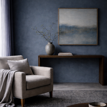
While warmth dominates, blues are quietly gaining sophistication. Dulux’s Rhythm of Blues collection, from soft sky to deep indigo, exemplifies the versatility of blue in 2026: it can be serene in a bedroom, layered in a library, or act as a backdrop for warm furnishings. Similarly, jewel-inspired tones, teal, emerald, sapphire, are being used as accent colours for joinery, alcoves, and statement pieces, adding depth without overtly darkening spaces.

The Textural Factor
Colour rarely exists in isolation. Across forecasts, there’s a shared emphasis on texture, layering, and materiality. Where Saints Go highlights that: “We are embracing earthy neutrals and deeper greens to create spaces that feel personal, layered, and tactile, a notable departure from the cool, detached minimalism of years past.”
Terracotta tiles, boucle upholstery, weathered wood, and woven rope are all being paired with these 2026 shades to create homes that feel curated yet relaxed, tactile yet sophisticated.

Image: Where Saints Go


Comments